Amoras Country House Hotel
Visual Identity
2018
Developed under the direction of etc&co
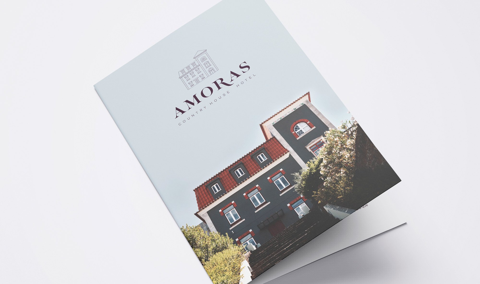
Amoras Country House Hotel is an old family mansion built in the early twentieth century and located in Proença-a-Nova, Portugal. With its quiet and tranquil environment, it’s the perfect escape to relax and recharge energy. It was built from a palace dated from 1905 and in 2004 it became a hotel with 33 rooms.
At first the hotel was called Hotel das Amoras, then Hotel +1 and now they wanted to go back to something similar to the first name the hotel had. So we came up with the name “Amoras Country House Hotel”.
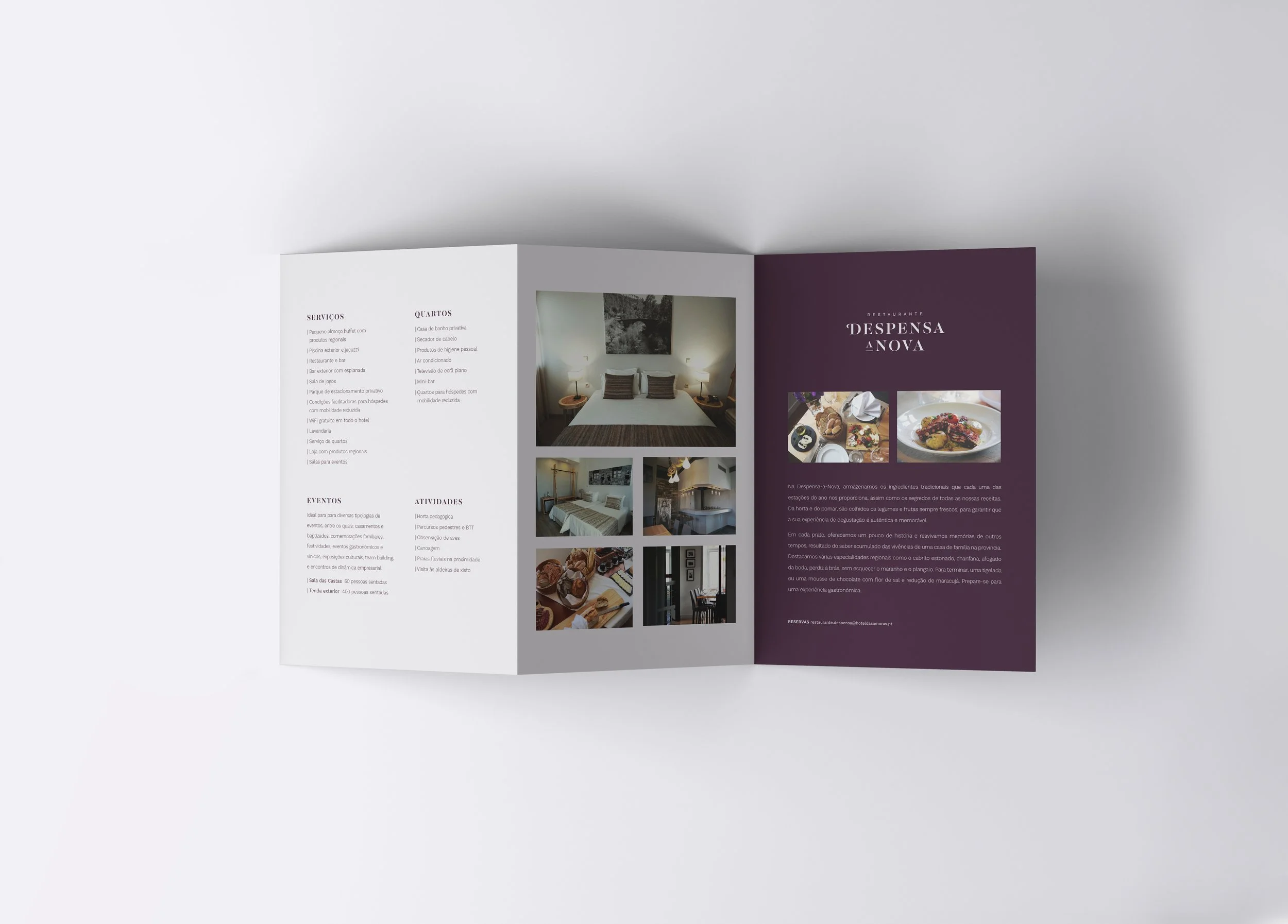
The first approach of the design tried to keep the bold font used in the previous hotel logo (when it was Hotel +1). However, we figured out that it needed to be more delicate and tried new things. The final logo reflects the history and elegance of the building, since it is a drawing of its main facade, and the comfort of a country house, with a bold - but serif - font. The idea was to honor the hotel’s background while adding a touch of modernity. The restaurant Despesa-a-Nova uses the same font so it is related to the hotel, even though everyone can go there to have lunch or dinner made out of local products.